
Type is a make believe typography event to be held at the CCCB. Our job as designers was to create a poster that emulated the qualities of timeless, cooperative, and memorable. T-shirts were also designed to further explore the advertising field.
Design Process
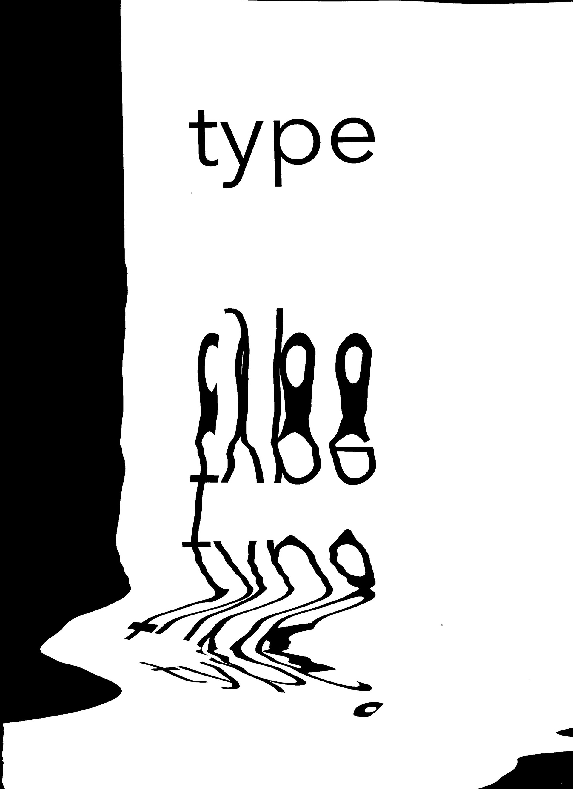
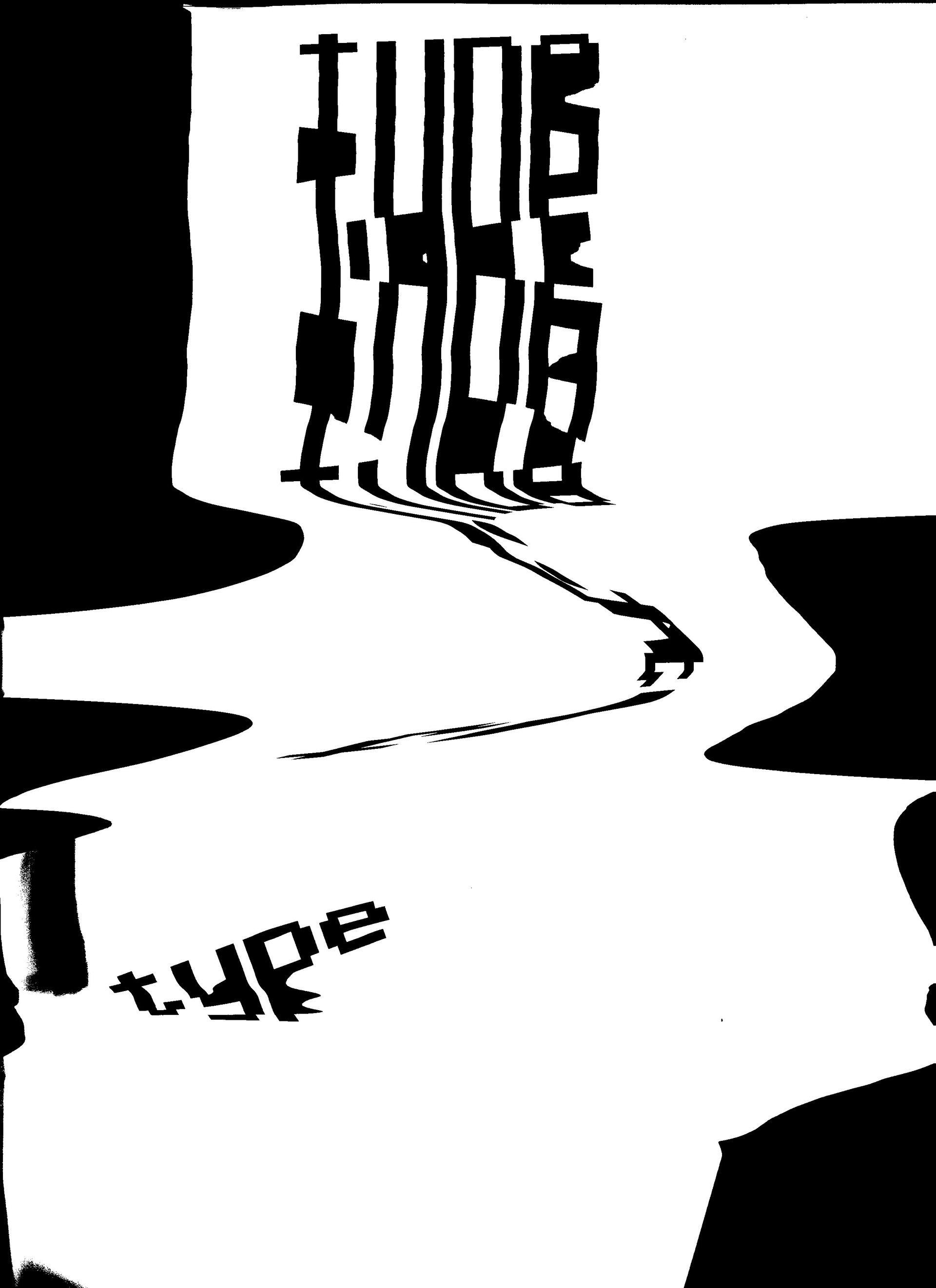
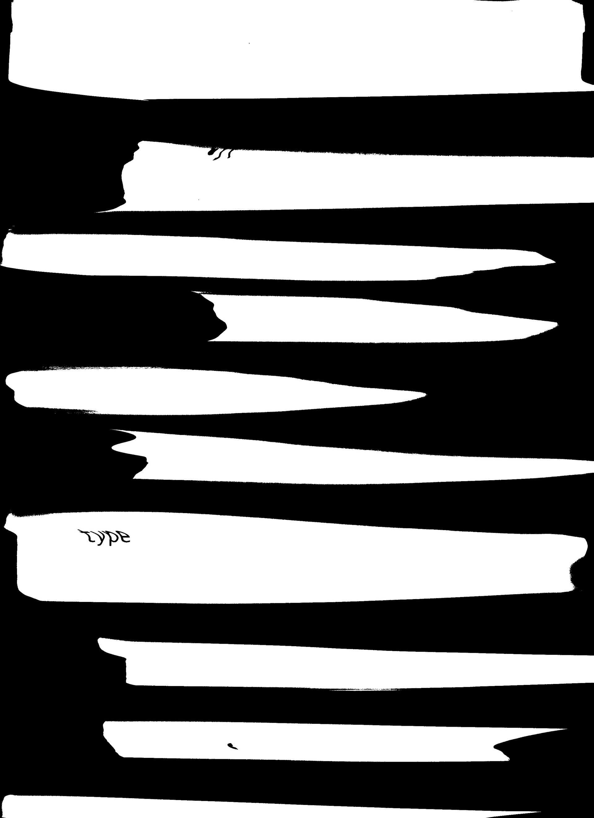
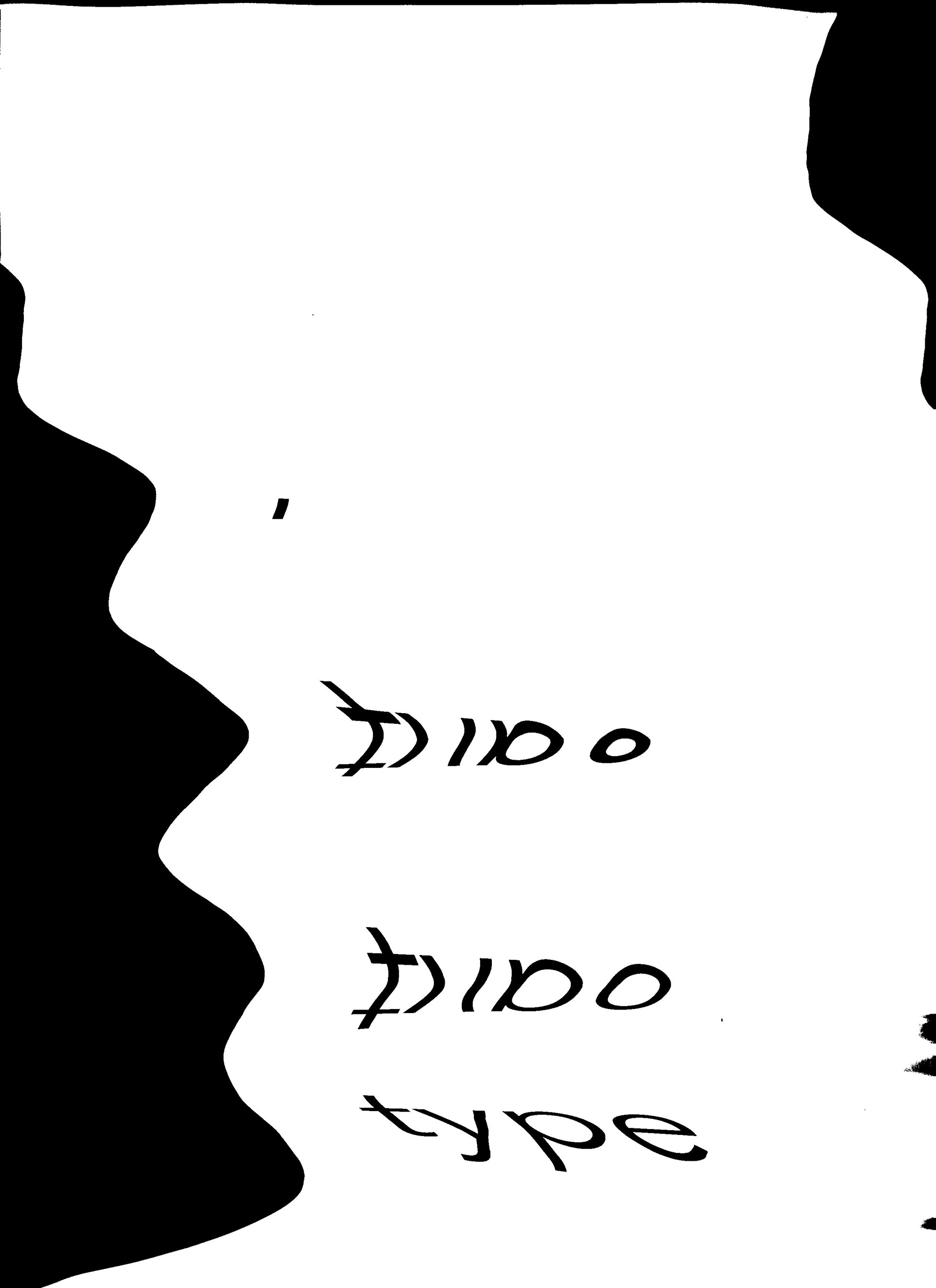
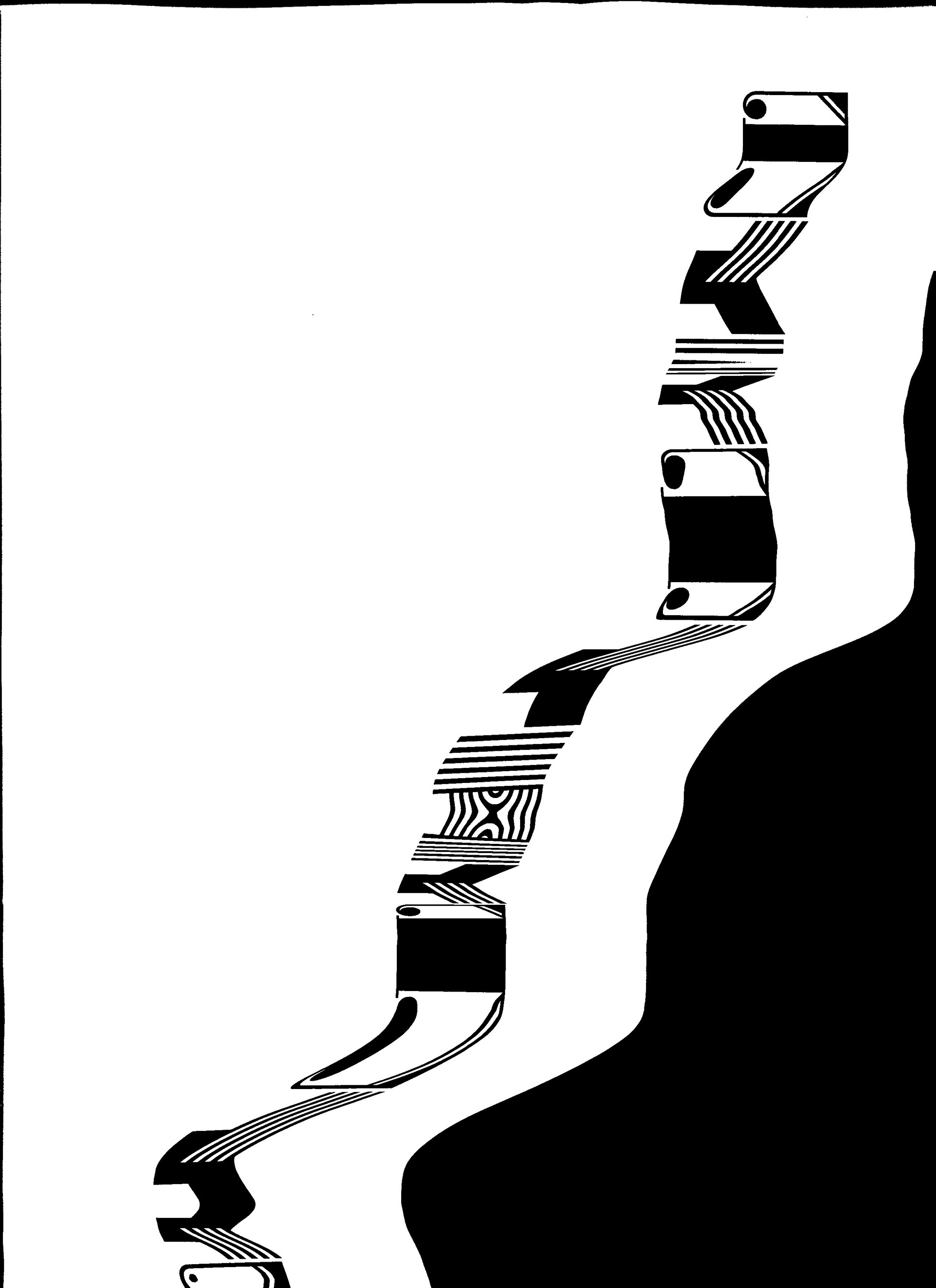
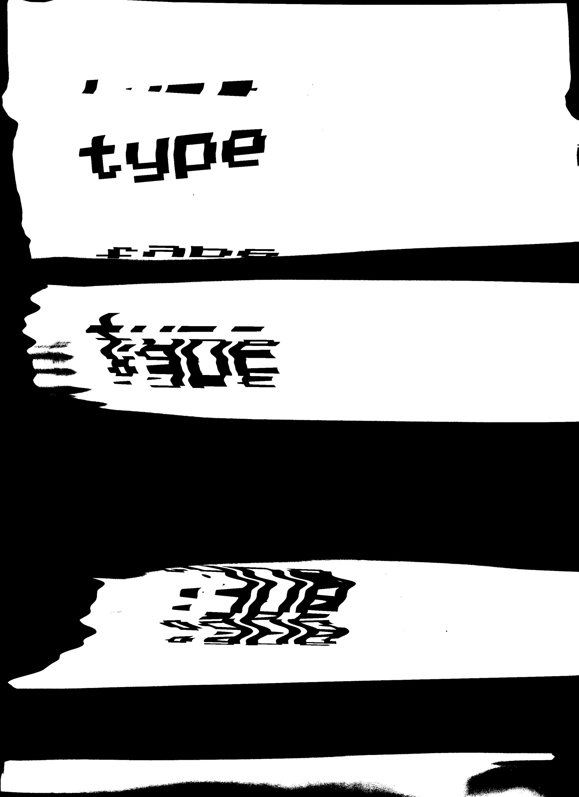
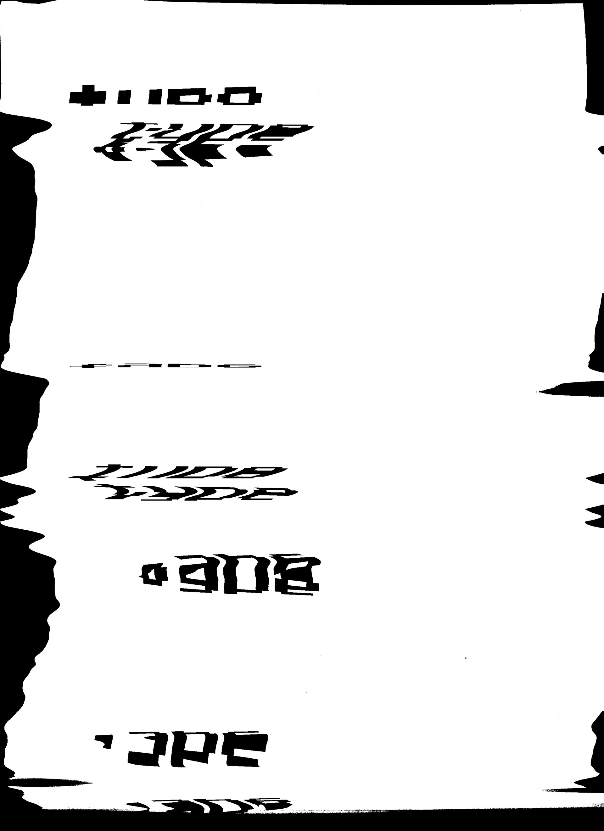
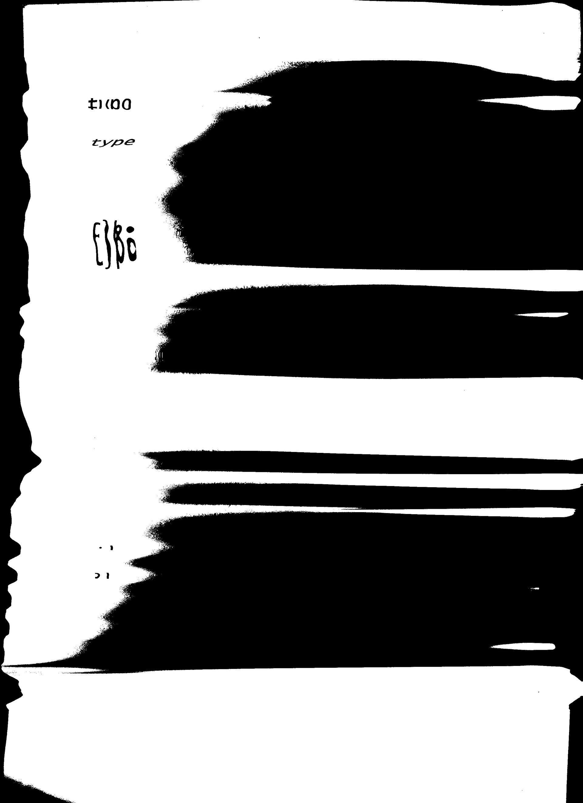
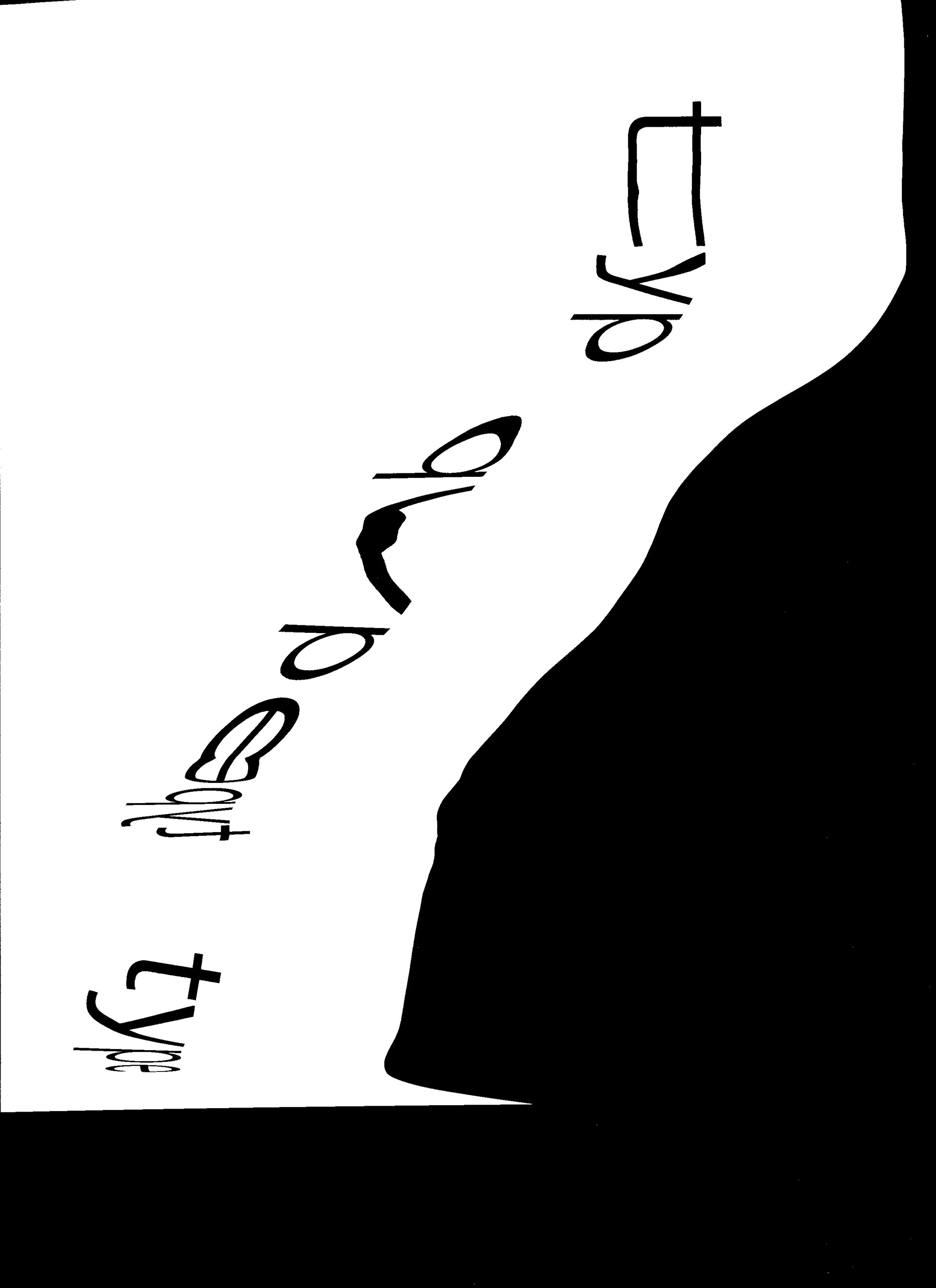
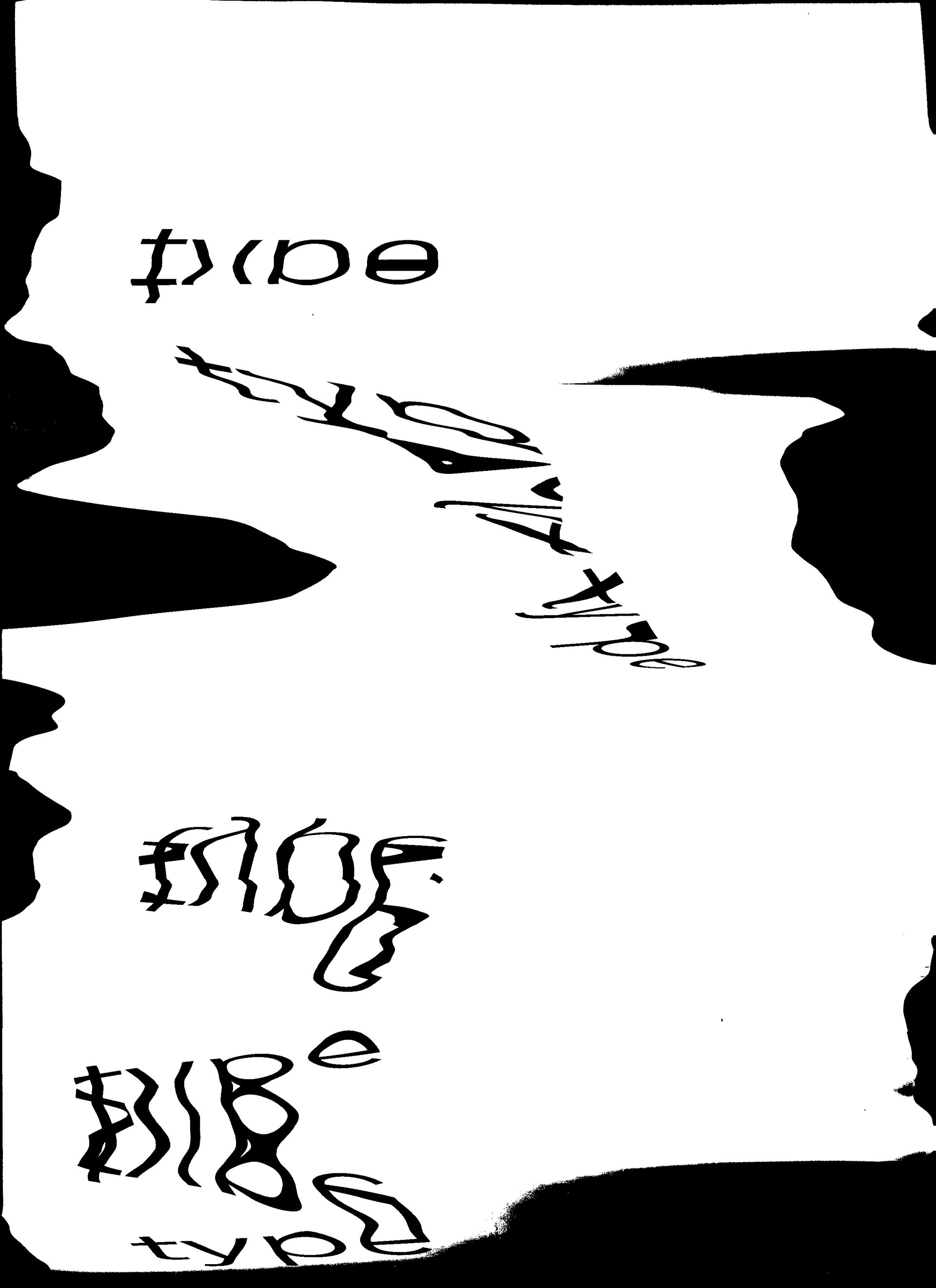
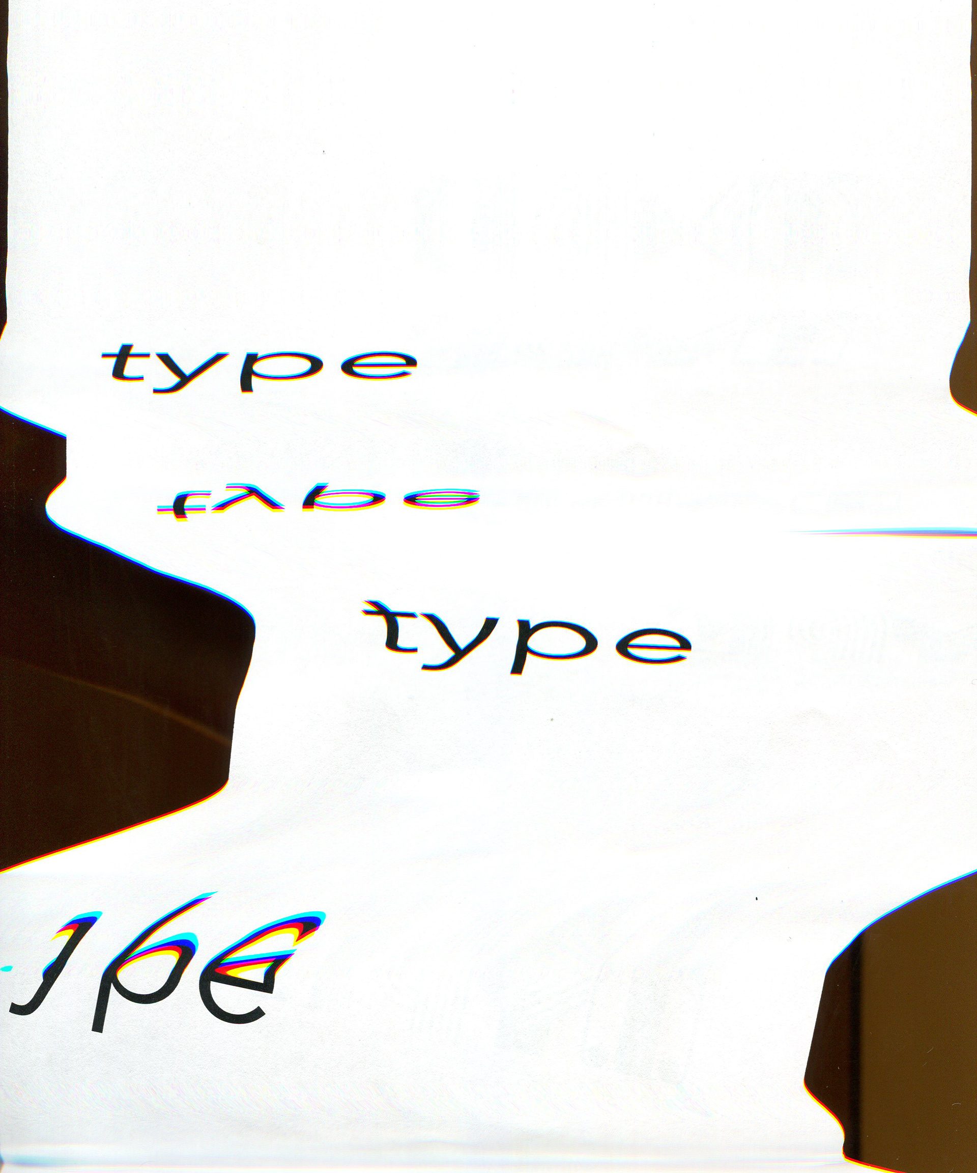
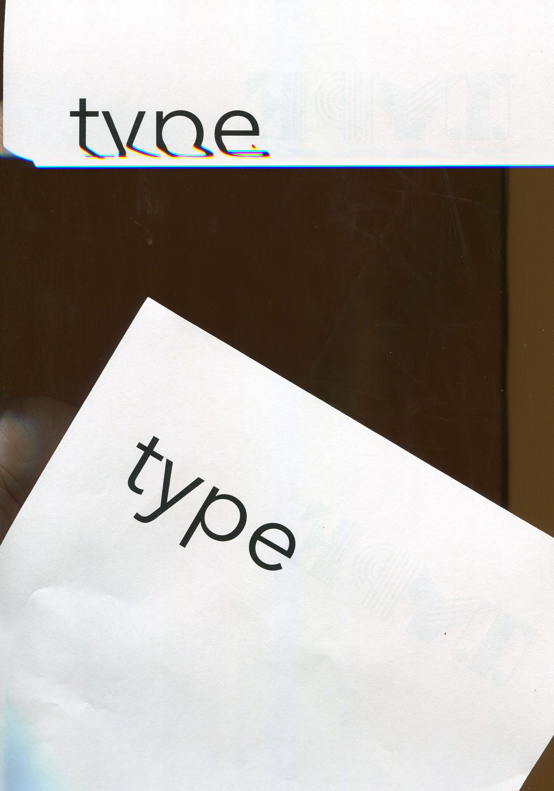
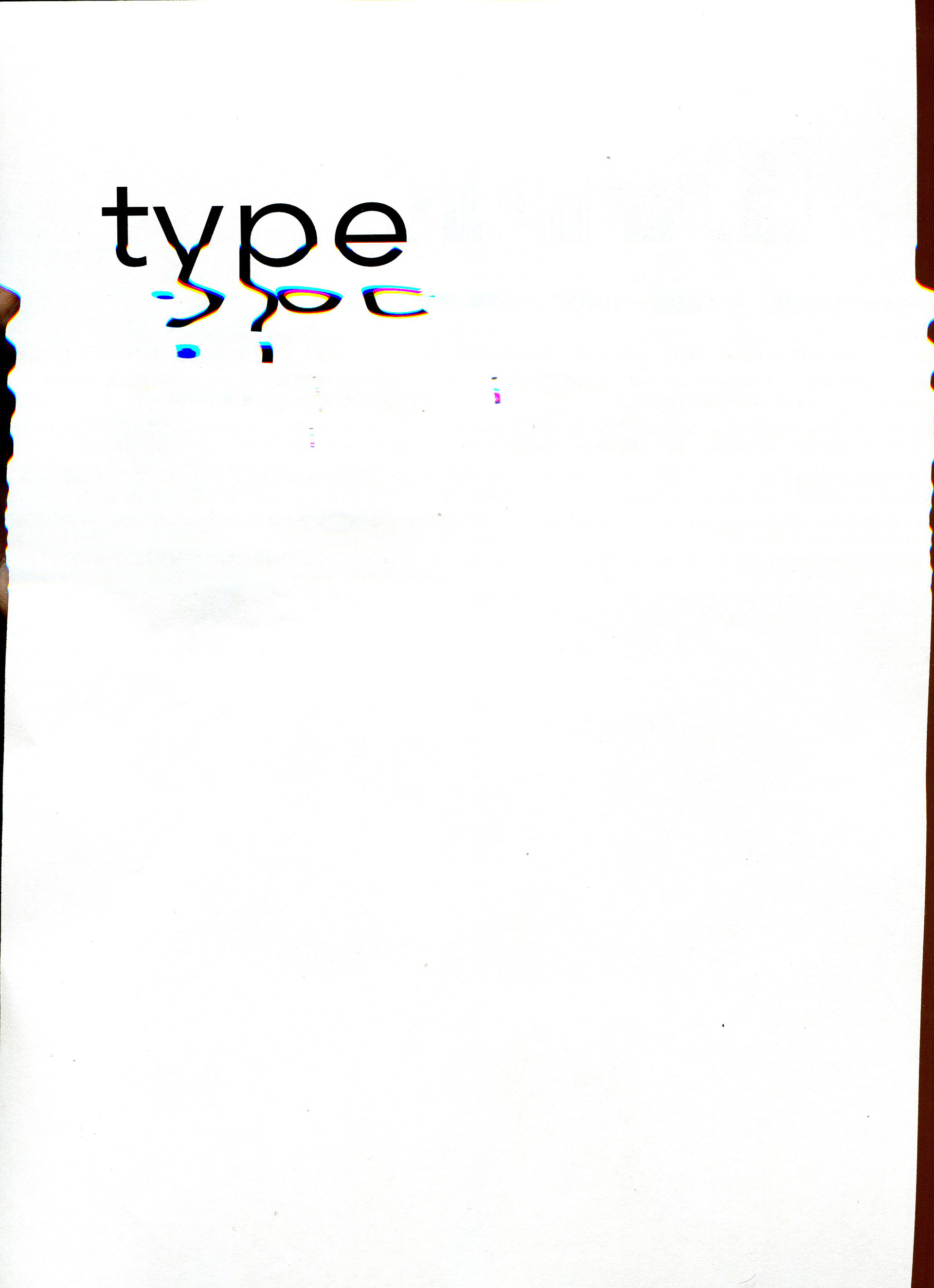
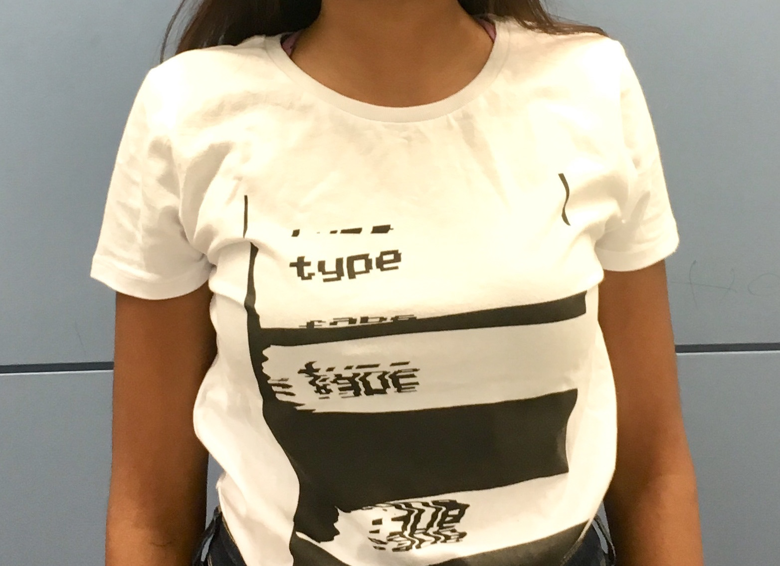
The methodology for creating the poster was using a printed paper with the word "type" and manipulating it on a photo scanner to create interesting effects. The pictures here are just a small sample of scans I created, as the total number was over 70 scans.
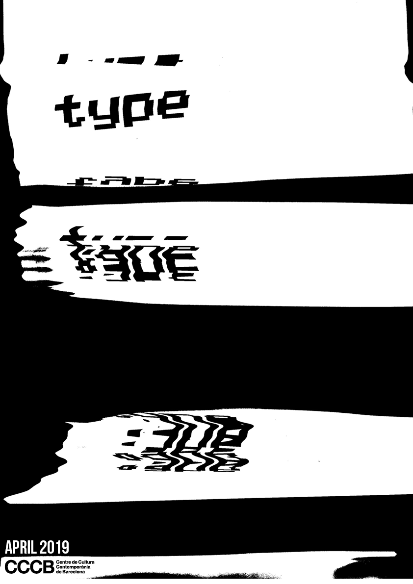
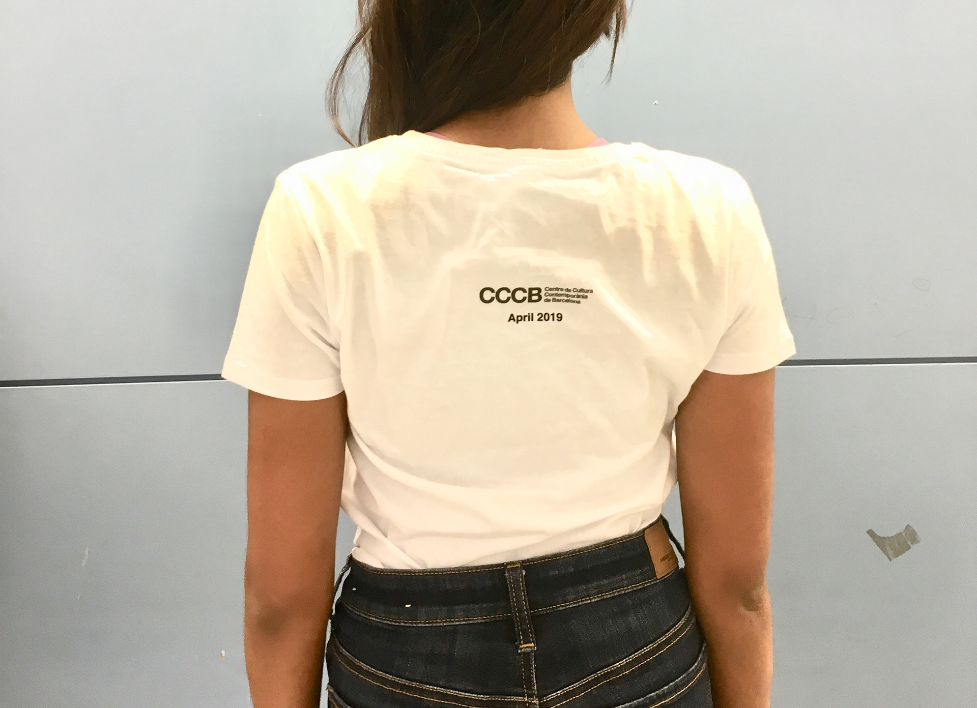
The next step was to finalize the design and create an A3 poster and a corresponding T-shirt just by simply adding the date and logo of CCCB, which can be seen here:
Analysis
The Typography class ranked each poster to see what was the most eye catching, yet where the intent of the poster was understood. My design was controversial, as some thought it met the requirements, while others could not understand the message. The best posters did not have the clearest "TYPE" but were creative in the placement of letters so that it still could be understood. In the future I will use this information when creating branding material.